

Color Palette
What Colors Go With a Gray Sofa? Build a Room Palette
Colors that work with a gray sofa depend on the gray, the fixed floor and wall materials, and the room’s daylight and evening lighting. Use fixed anchors, the physical sofa sample, one bridge color and one removable accent; then test the whole group in two lighting conditions before buying more decor.
On this page
Gray sofas work with warm whites, greiges, natural wood, camel, terracotta and olive—or with soft whites, navy, muted blue and black. The right group depends on whether the gray reads warmer, cooler, lighter or darker beside the room’s fixed finishes. Build the palette from real samples, not from the color name on a screen.
Fast answer: keep the floor, wall and largest wood tone visible; place the sofa fabric beside them; choose one bridge color that relates to both the gray and a fixed material; then add one smaller accent. View the group in daylight and under the evening lamps you actually use.
Do not start by asking for an accent color
A living room palette is a relationship among surfaces. The sofa is large, but it is not the only large color. Flooring, wall paint, a fireplace, built-ins, curtains and a large rug can control the room just as strongly. If those anchors stay, the new palette must negotiate with them.
Take one wide photo facing the sofa wall and another from the doorway. List every material that is expensive or difficult to change. Do not reduce oak, stone or brick to a generic “brown.” Place its physical sample—or a close object from the room—next to the sofa swatch. Your aim is not to name every undertone correctly; it is to see which materials argue when they touch.
Read the gray in the room where it will live
Move the sofa swatch to three positions: beside the wall, on the floor or rug, and next to the largest wood or stone surface. Add plain white, a warm beige and a muted blue sample. The comparison can reveal whether the gray leans warmer, cooler or relatively neutral in that room.
Repeat the comparison in daytime and under the evening lamps. NIST explains that the color appearance of objects under artificial lighting is an important characteristic of a light source. Its glossary also defines metamerism: samples that seem to match can reveal spectral differences under another illumination. The practical lesson is simple: one store light, phone photo or midday glance is not enough evidence for a room palette.
Use a two-light, three-distance test
- Two lights: check the group in representative daylight and with the normal evening lighting.
- Near: view materials where they physically meet—the sofa beside the rug, pillow or wall.
- Mid-room: sit at the normal viewing position and check balance.
- Doorway: step back until all large surfaces enter one frame.
Record a mismatch as an observation: “the wall looks pinker beside this gray at night” is more useful than “the undertone is wrong.”
Build the palette in four roles

1. Fixed anchors
Start with the wall, floor, stone and major wood. If a fixed anchor is visually warm, a warm white, oatmeal, camel or muted earth color can help a neutral gray sofa join it. If the room is cooler—blue-gray stone, cooler flooring or clean white walls—a muted blue, navy or blue-green bridge may feel more coherent.
2. The sofa gray
Use the actual upholstery sample and, if possible, a full cushion or product view. Texture changes the read: corduroy ribs, velvet nap, chenille yarn and a smooth weave catch light differently. Do not transfer a palette from one gray material to another without repeating the room test.
3. One bridge color
The bridge connects the sofa with something that already exists. Warm wood can bridge to a gray sofa through camel leather, tobacco, rust or oatmeal. A cool painting can bridge through navy, slate blue or muted green. Repeat the bridge at least twice—perhaps rug plus pillow, or wood table plus frame—so it looks intentional.
4. One removable accent
Use the strongest color where it is inexpensive to change: a pillow cover, throw, vase, small artwork detail or flowers. The accent does not need to be bright. Burgundy, inky navy, olive or deep terracotta can provide contrast without becoming the largest visual field.
Four gray-sofa palettes to test

Warm mid-gray: oatmeal, oak and terracotta
This route works when the gray settles comfortably beside creamy walls, honey or medium wood, and warmer floors. Use oatmeal or flax for the background, repeat the wood tone in a table or frame, and place terracotta or rust in small textiles. Add olive if the room already has plants or green artwork.
Cool mid-gray: soft white, navy and black
Use this as a test when the gray looks slightly blue beside the wall. Soft white keeps the room from turning icy, navy supplies depth, and a small amount of black can repeat metal legs, a lamp or frame. If the room becomes severe, add texture or a medium natural wood rather than another strong color.
Charcoal: ivory, camel and olive
A dark sofa already supplies visual weight. Use a lighter wall, rug or curtain field to separate its outline. Camel and warm wood can prevent the room from becoming an all-gray stack, while olive adds a quieter color connection. Keep the largest neighboring dark surface distinct enough that the sofa does not disappear into it.
Light gray: greige, walnut and muted green
Light gray can sit between warm and cool materials. Greige can bridge to a warmer wall or rug, walnut adds a deeper anchor, and muted green introduces color without high contrast. Check the light gray against white trim at night; some pairs that look separate in daylight may flatten together under one lamp.
Choose wall, rug and curtains in that order of risk
Wall paint is easy to sample but large once applied. A rug can be costly and changes both color and texture across the floor. Curtains sit vertically beside the wall and window light, so they can shift how the sofa reads through the day. Test all three before committing.
- Wall: paint a movable sample board instead of a tiny spot. Place it behind and beside the sofa fabric.
- Rug: bring the sofa swatch to the rug sample. Check pattern scale and whether the background repeats a room anchor.
- Curtains: compare the sample both backlit and with the curtains closed. A fabric can appear lighter when daylight passes through it.
- Wood and metal: repeat one existing wood and one metal finish before introducing another.
Use the supplied room image as a visual teardown
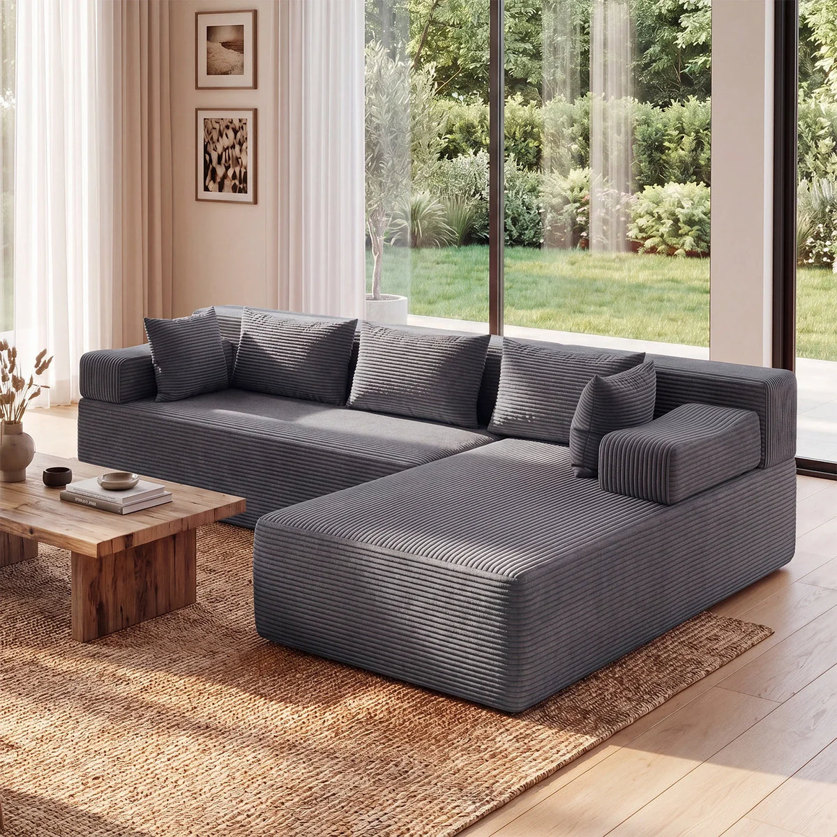
The supplied Monvane visual shows a gray corduroy L-shaped sectional with a warm brown rug, warm wood coffee table, light curtains and green outdoor foliage. The room does not depend on a bright accent. Warm floor-level materials bridge the cool-looking gray to the architecture, while the light curtains maintain separation around the dark sofa.
The current Monvane L-Shaped Sectional Couch in Corduroy page lists Grey as a color option and corduroy as the material. That product identity supports the image match; it does not prove that the gray will look identical on every screen or under every lamp. Request or use a current physical sample when exact coordination matters.
Keep texture from becoming a hidden color problem
A ribbed or directional fabric creates shadows. A glossy table reflects light. A nubby rug breaks one color into highlights and dark pockets. When two samples share a color name but have different texture, test them touching and separated. Sometimes texture provides enough contrast; sometimes it makes two near-grays look accidentally mismatched.
Photograph the test, but make the decision in person. Phone processing, white balance and display settings can change the image. Use photos to compare arrangements and remember locations, not as the final color standard.
Five palette mistakes that make gray feel difficult
- Buying every item in gray. Similar grays can expose mismatched temperature and value without providing a bridge.
- Choosing the accent first. The fixed floor and wall still control whether that accent belongs.
- Using a single light test. A match can change under another lamp or daylight condition.
- Adding too many new finishes. Repeat existing wood and metal before creating another material family.
- Copying a screen palette literally. Digital swatches do not contain the texture, scale or light behavior of the physical room.
Questions about colors that go with a gray sofa
What wall colors work with a gray sofa?
Warm white, soft white, greige and muted color can all work. Compare paint boards with the sofa fabric, floor and trim in daylight and evening light. The correct wall is the one that coordinates with all fixed anchors, not the sofa alone.
Can I mix gray and brown in a living room?
Yes. Brown wood, camel, tobacco or a warm rug can bridge a gray sofa to warm floors or architecture. Repeat the brown family in at least two visible places and test the values together.
What color rug goes with a charcoal sofa?
Start with a lighter rug background that relates to the wall or floor, then use camel, ivory, olive, muted rust or navy according to the room’s fixed materials. Check that the rug still separates from the sofa at a distance.
Do navy and gray work together?
They can, especially when the gray reads cooler. Add soft white or a natural material so the room has value and texture variation. Test both colors under the evening light to avoid an unexpectedly flat dark field.
How many accent colors should I use?
Begin with one bridge color and one smaller accent. Add another only when it has a specific role and repeats an existing room element. This is an editing method, not a fixed decorating law.
Approve the palette as a physical group
Put the sofa sample, wall board, floor or wood sample, rug and two accessory colors in one tray. Review it in two lighting conditions and from three distances. If the group works, photograph and label it before shopping. If the current gray corduroy product is under consideration, recheck the selected option and current terms on the product page; otherwise use the same method for another gray sofa without carrying over an untested digital palette.